 Story: Christopher Holder
You could hardly want for two more conflicting styles. In the blue (pill) corner is the Chemist Warehouse. No pretences here, just pharmaceutical products at trim prices piled high on industrial shelving. In the Green (Frogskin) corner is Oakley. Nothing mundane here at an Oakley concept store, it’s all about image and branding… swish, swank apparel and eyewear.
The styles couldn’t be more different but both are utterly dependent on its marketing.
You won’t find a Weather Channel ticker on the screen or hear someone screaming ‘only nine, ninety-nine!’
Oakley became the marketers’ darlings with its subversive approach to making its sunnies so darn desirable. For a period there every second car would be a rolling Oakley advertisement, with Thermonuclear Protection decaled large across the back window. Literally, marketing you couldn’t pay for.
Chemist Warehouse depends on its blanket bombing approach to the omni channel – TV, radio, newspapers, catalogues… you simply cannot escape the reach of its marketing tentacles.
Now both have launched highly successful digital signage campaigns, and, again, the approach could hardly be different.
In the Blue Corner: Chemist Warehouse grabs the ‘substance over style’ knob and cranks it to 11. Its signage is alive with infomercials, RSS tickers, ads, promos, it’s like a roiling, blinking, busy-bee catalogue that’s driving sales. In fact, if anything, Chemist Warehouse is bucking much of what the current received wisdom is regarding retail signage. Whereas five years ago we were all intoxicated by the whiff of using signage to generate revenue, as we busily divvied up our screens to display five different messages. Now? The pundits say ‘no’. Don’t zone your screens, don’t concern yourself with selling space on your network, don’t worry about audio, simply make the screens work for you with a clear, unequivocal message. Well, the commentariat has a new precedent to concern itself with. Chemist Warehouse is breaking the rules and making money – money from increased in-store sales, and money from brands falling over themselves to advertise on the network.
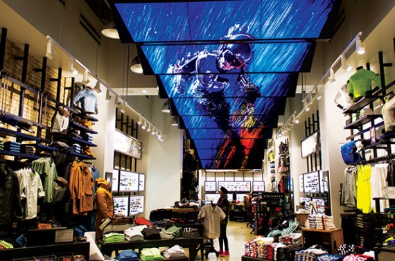
In the Green Corner: Oakley’s 5th Avenue store in New York takes the ‘style over substance’ knob and cranks it to 11. Oakley is reimagining itself with a new slogan Disruptive By Design (sounds like a couple of kids at the back of my Year 7 class). Oakley engaged the Moment Factory to imagine what digital signage might look like in the concept store. But clearly it was going to have be disruptive. You’ll see the results later this issue (a snifter is pictured on this page), but take it from me, it’s high concept. You won’t find a Weather Channel ticker on the screen or hear someone screaming ‘only nine, ninety-nine!’.
Both executions are a success. Both make the shopper feel something about the store. Both reinforce key messages. For one it’s ‘price, choice, trust’ for the other it’s ‘style, innovation, high performance’. Both have been instituted with care and attention to every detail.
Not sure where you fit in the signage gamut curve – if you’re closer to the unglamorous yet functional Chemist Warehouse end of the axis, or if you’re a painfully cool/cutting edge outlier — but above all, your digital signage has to serve your brand.
Christopher Holder,
Editorial Director

